... And Beyond.

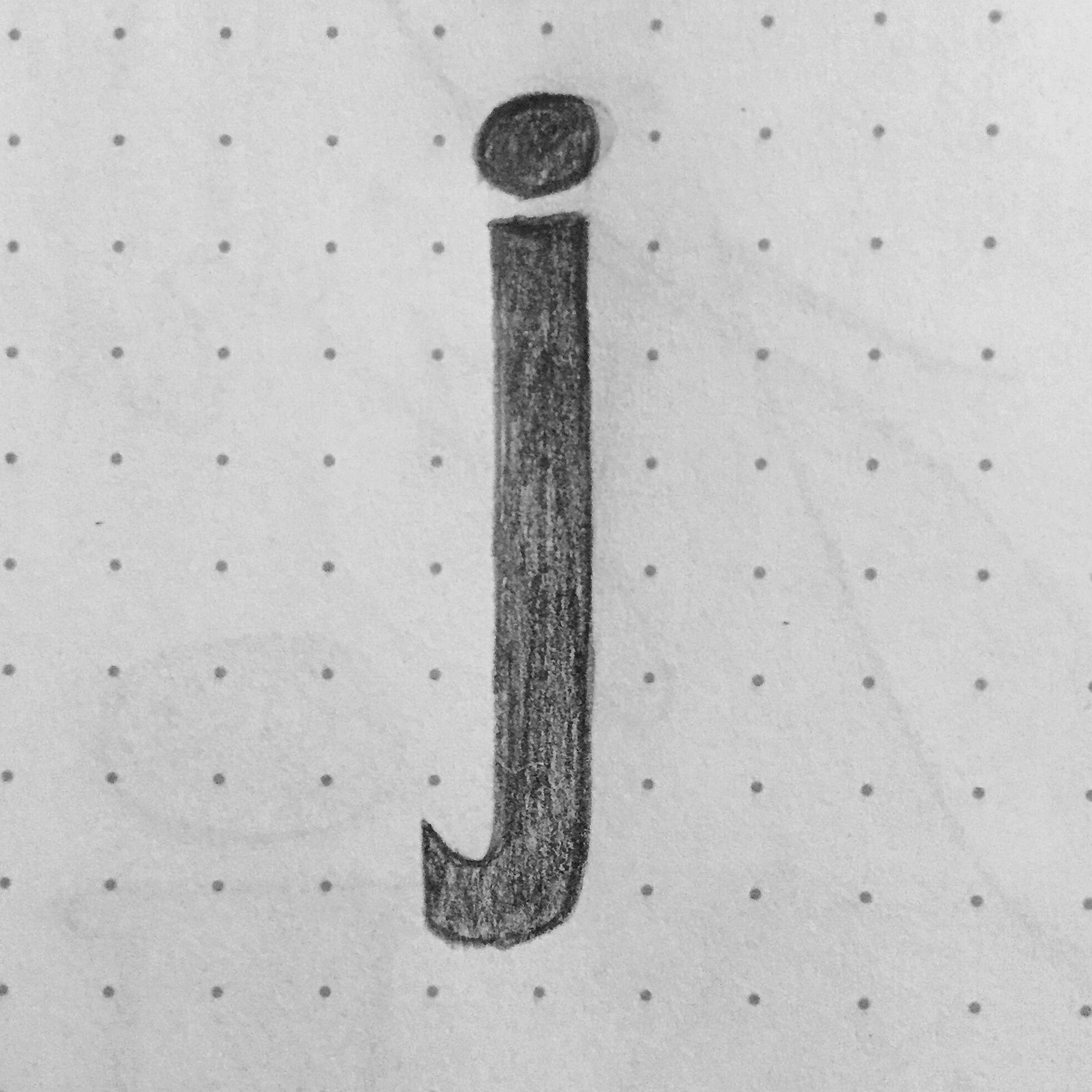
I finished the Upper and Lower cases as well as a round of digits. And then, the horror of the empty page. I really love Bodoni and kept drawing those forms for a few days, then branched out and tried experimenting with other stuff.

This went OK for a bit, but ultimately it really bothered me that these pieces didn't communicate anything. Or they were inside jokes that made zero sense to anyone else. Or they were snarky.

Also, around this time I saw a piece from James Victore that kicked my ass. Here it is:

POINT TAKEN, James Victore. It's added a whole other layer to make the work communicate an idea beyond the engineering of lettering and type design. So with those words burned into my brain, new forms:

This brings me up to #95/366. 

The Lower Case

Coming down with a bug is never good for your process—or so I thought. Somewhere between days 39 and 40 of this year I picked up a massive head cold. Not wanting sickness to derail a relatively new daily project I was working on, I switched over to sketching. My original intent was to go back to converting my sketches to vector files once I felt better. I really enjoy working with pencil and paper and have stuck with that format since. (I'm using a Pentel GraphGear 500 and a stack of Field Notes notebooks for the trainspotters out there.)

Them Numbers Ain't Real

Now that we're heavily into the political season I thought it would be a great opportunity to talk about a quote that's been in my brain since the last (presidential) election in 2012. NPR was interviewing random people on the street to talk about how the polling numbers were shaping up in favor of this candidate over that candidate, and a gentleman with a very strong southern accent refused to acknowledge the concept that Obama could win reelection, saying instead, "Them numbers ain't real." It's a real crime that I can't find that interview, though I'm sure it's up on the internet somewhere. For now, I'll leave you with some very real numbers I've been drawing.

Designing a Poster - Process Step Two

In rereading what I'd written in my last post, I somehow feel more able to communicate my true point in those last paragraphs. There is a symmetry to the emotional context and visual content in Kubrick's films that I'm not sure I need to echo with my work. The same way people end reviews of The Sopranos' final episode by cutting off mid-word (the final episode cut to black quite abruptly rather than summarize the show), I think there's a desire when it comes to Kubrick to somehow become the Kubrick of poster design, of movie reviews, of classical music selection, etc., until it's so "meta" that you can't tell if what you've made is born of sarcasm or not.

My desire to move away from something like this occurred while putting together some images of the sketches I've been working on. Below, you'll see rough sketches of how my idea for the poster evolved:

I'm moving fairly quickly while I'm sketching because, as I mentioned in the previous post, I've been thinking about this for some time and I've eliminated several ideas already. Obviously when I'm doing client work I try to sketch everything, good and bad.

An initial idea on the far left was to use the numbers 2-0-0-1 with some color overlay. Another idea (same image) was pulled from the book: Bowman's pod as it moved through an enormous sun, engulfed in flame and nearly invisible against the mass of fire. The center sketch is my first drawing of the lyrics to "Daisy Bell (Bicycle Built for Two)." (At the top of the page is a sketch of the strong radio waves released by the monolith on contact with direct sunlight.) The drawing to the right is playing with the type a bit more and drawing out the lines to suggest change and perhaps depth, though to be honest the dot grid on the page is restraining the emotion I am trying to evoke with this design.

Below is my most final sketch (yes, I know I misspelled "Stanley"):

The use of type here is much more suggestive of the words I had initially settled on during my brainstorm for this project: anxiety, uneasiness, tension, depth, existential dread, solitude, the unknowable vastness of space, abandonment, awe, loss of mental faculty.

I had put this project away for a week—work was slamming and I do have a 10-month-old—and in looking at this again, it feels so much more evocative of the loss of mental faculty than anything else. In growing old we fear death at the root of all other fears: abandonment, isolation, etc. While HAL, it could be argued, is only a computer, he is the most advanced artificial intelligence in existence. Is his death dissimilar to ours? What happens when our minds degrade? HAL's death is just as compelling as Bowman's impending isolation.

I'll be posting a step 3, which will be digital sketches and concepts, and a step 4, which will likely be the finished work with my own assessment, all within the next several weeks.